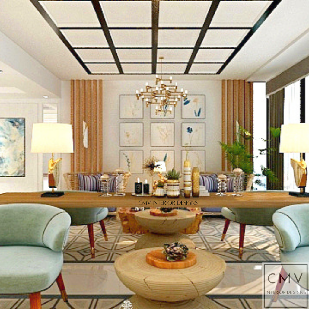
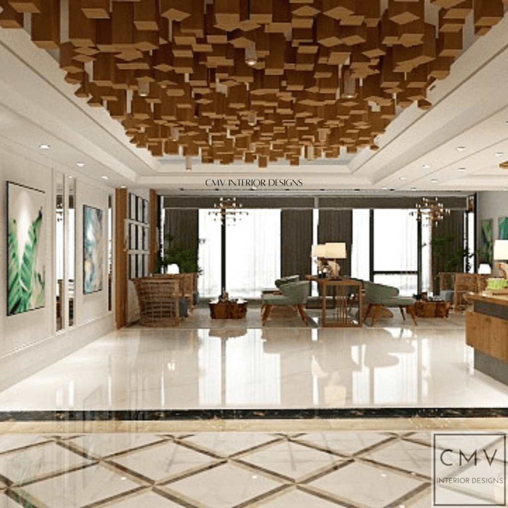
SYMMETRICAL BALANCE. Discover our design approach for this concept project #FilipinoFestiveHotel and for this presentation we used symmetrical balance as our main design principle for this area.
Symmetrical balance is where the two sides of the composition are exactly the same (or very nearly the same) and they make a mirror image of each other. Symmetrical balance creates a static, stable composition and is suited to informative or instructional visual communications.
LINE. Love at the first line. Imagine how a simple line can affect your perception of the space. Our design trick to accentuate the ceiling height? use vertical lines that will draw attention from floor to ceiling and create an illusion of height.
The line can be used to;
emphasize something (an outline on a character, underline),
to divide components in a composition (column line),
to create a figure (lines in an observational sketch),
to create tone and texture (cross-hatching, shading),
to create a form (lines on an angle),
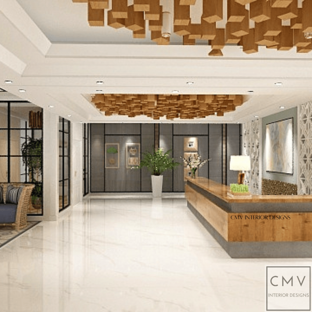
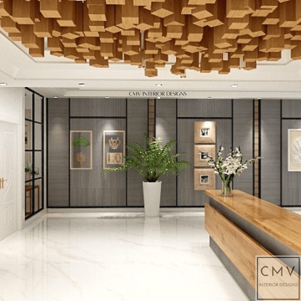
FORM. Strong geometric, biomorphic, and abstract. We want to experiment in design by introducing new ways to use the forms that we commonly use or have seen. This includes the shape of the wooden blocks as our ceiling accent.
Form is a three-dimensional entity. It is often made from shapes, lines, or even colors. Form creates space and depth.
Emily in Paris office but make it better? Kidding aside. (But this design can clearly be one of the places they can shoot in for Emily in Paris, though).
The black, white, and gold color palette never goes wrong, especially when added with a complementary element: wood. This clean space can house clothes and other things alike needed for studios as this design is very clean and fancy.
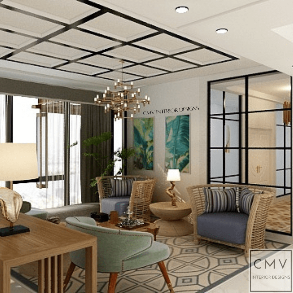
Muted colors are undeniably comforting and could really look nice only when matched with the appropriate hues and elements. This lobby is certainly the epitome of that eclectic interior.
This is a different angle view of our hygge-curated space. It shows the design on the ceiling which looks exactly like the design behind one of our couches.
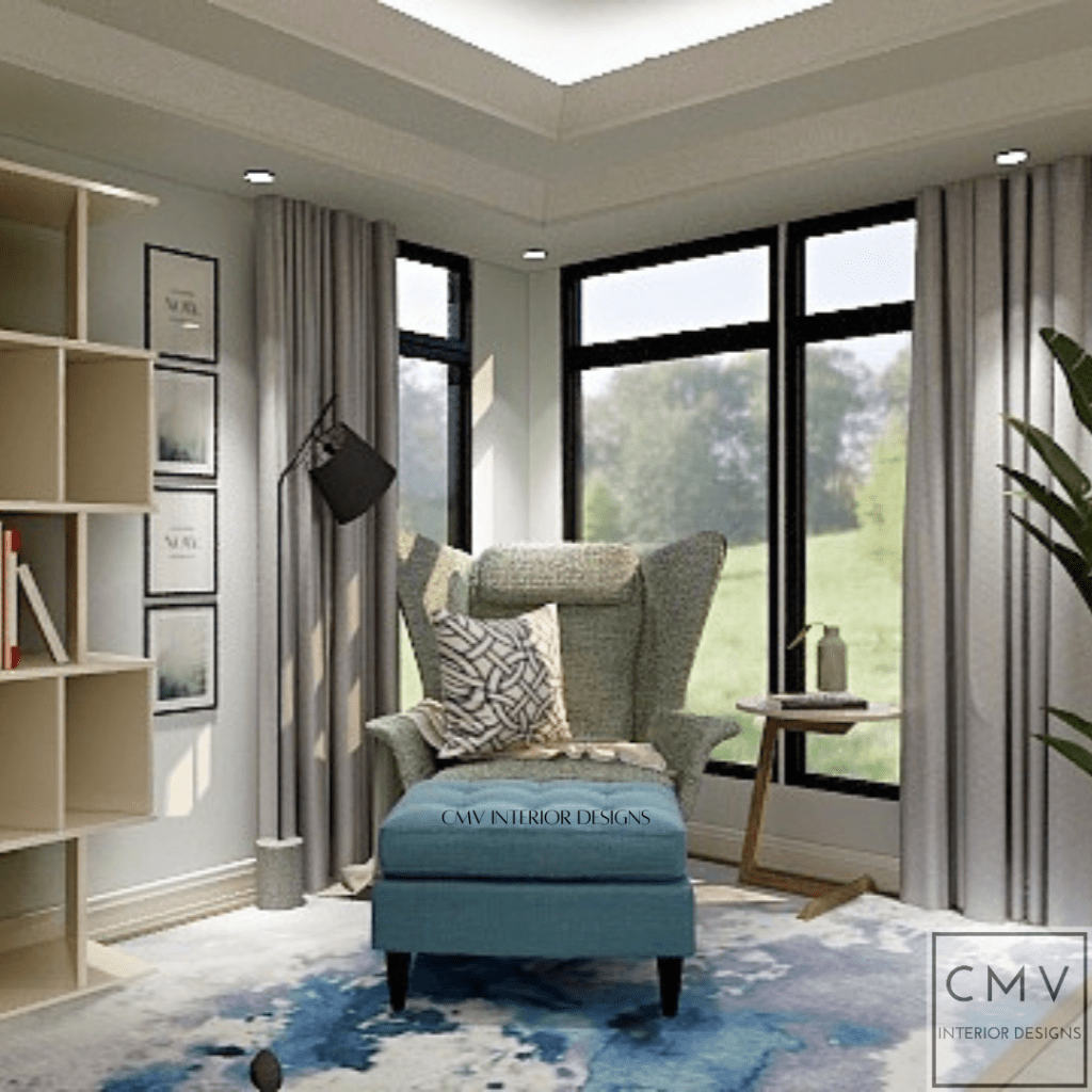
With the guide of our designer color pick of the week, this design gives you nothing but a calming place to work at. It is simple but functional—definitely a place you can be productive at.
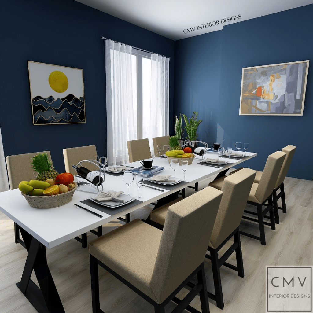
A Queen’s Gambit set dining area? Possibly!
This interior gives you a vintage vibe but with modern touches, especially with its utensils and frames. The colors are complementary which can definitely make your meal taste way better.
This simple and “cozy” interior is definitely what you’ll dive into after a long day. With its chic contrasting colors and classy black lamps from the ceiling, this radiates nothing but warmth and comfort.
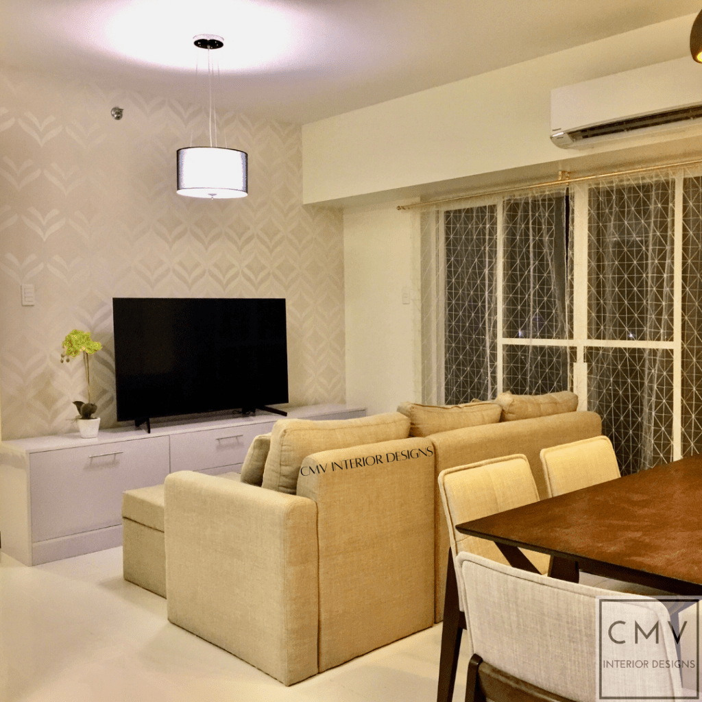
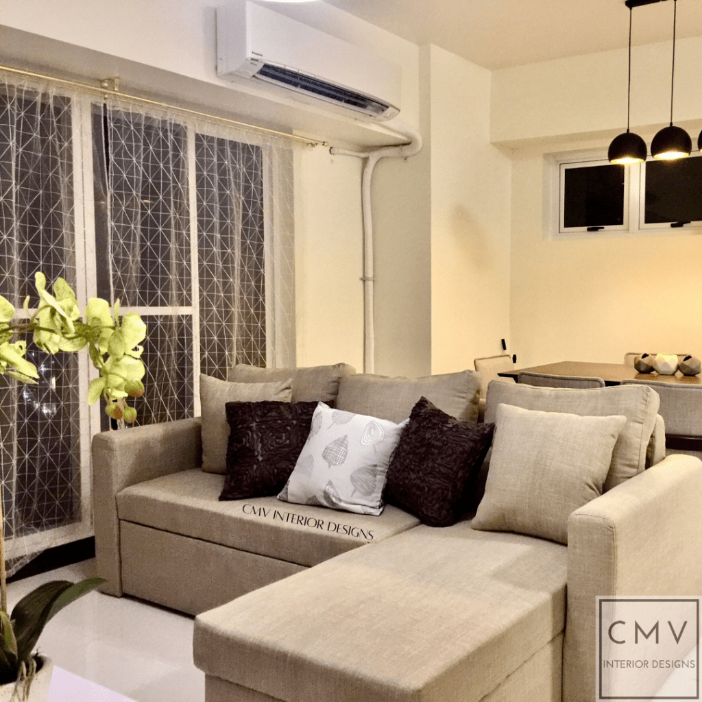
Undeniably, this is cozy depicted in a single frame. This space is evidently small, but the place has been utilized for comfort, storage, and entertainment alike. With its bright light from the hanging lamp to the widescreen tv, you can never fathom how much you can do even with small things, can’t you?

Well-appointed. Collected. Chic.
This space shows you can definitely put things of different patterns and colors together, but they can still look good and not messy (only when done right). With its beautiful frame for the mirror to the different patterns and colors of the pillowcase and wall, this interior shows how things can still look good even when they are different.
