Start with a Mood or Purpose
In order to choose a perfect color for your room, you must first figure out the mood or purpose of the space. Think about how you want the room to feel. Color has a profound impact on mood, energy, and even perception of space. That’s why defining the room’s purpose is the foundation for choosing the perfect palette.
Go and ask yourself:
- Do you want it to be calm and restful, like a bedroom retreat? Or energetic and lively, like a kitchen or home office?
- Will it be used mainly during the day or in the evening?
- Do I want the room to feel bigger, smaller, brighter, or dramatic?
- What’s my personal style or inspiration for the space?
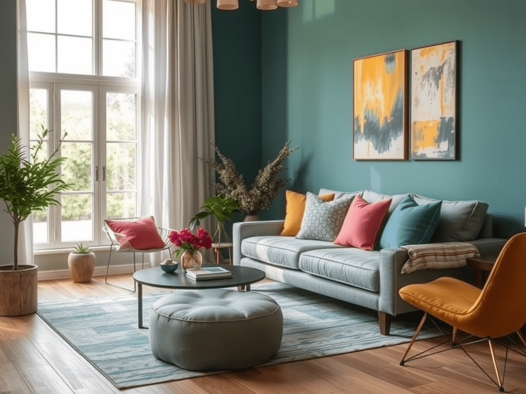
Here are some color suggestions based on your preferred mood:
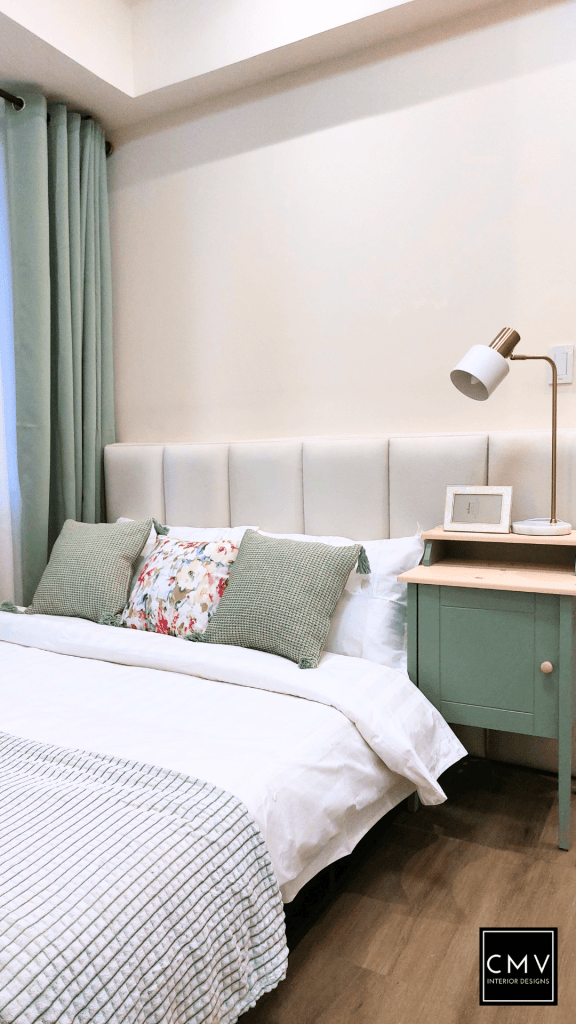
Calming: Consider soft blues, greens, or neutral
Energizing: Opt for vibrant hues like coral, mustard yellow, or teal.
Cozy: Warm tones like terracotta, caramel, and deep forest greens create intimacy.
Colors in terms of Textures and Materials
When we talk about color in interior design, it’s not just about what color you choose—but how that color is expressed through different textures and finishes. The same hue can feel entirely different depending on the material it’s applied to. Understanding this adds richness and intention to your design choices.
Textured Materials
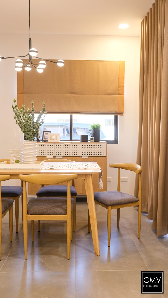
Natural Wood
Introduces warmth and organic variation
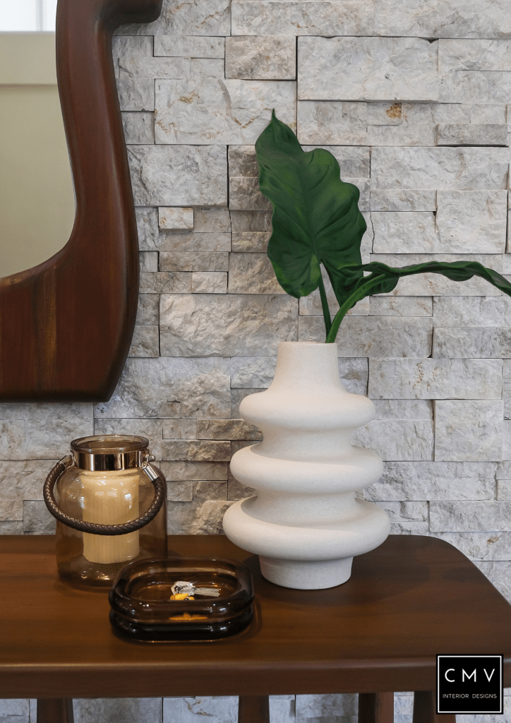
Plaster, Brick, or Stone
Offers visual interest through natural irregularities

Leather (Natural or Dyed)
Offers depth, richness, and patina over time. Leather absorbs and reflects light differently depending on its finish (matte, waxed, or glossy), which can add dimension to warm or cool palettes alike.
Metal Accents (Brass, Chrome, Blackened Steel)
While not a large surface, metallic finishes affect color balance and contrast in a room. Brass warms up cool palettes, while chrome or stainless steel enhances modern, crisp color schemes.
